Wisconsin Conservation Voices (WCV) struggled to clearly communicate the purpose and available resources of its Wisconsin Native Vote (WNV) program due to an unclear content hierarchy and accessibility limitations. The project focused on evaluating and redesigning key sections of the Native Vote and Voting Info pages to improve clarity, better highlight program impact, and enhance accessibility, all while designing within the technical constraints of Squarespace and a condensed timeline from mid-October to early December.
Enable users to quickly understand the purpose, impact, involvement opportunities, and resources provided by the WNV program by improving the accessibility, usability, and credibility of the Native Vote and Voting Info pages.
We conducted a review of the existing site to gain insight into WCV and the WNV program. We learned that the purpose of the Native Vote and Voting Info web pages is to promote civic engagement and highlight the program’s impact; that their target audience is Native Americans of voting age in Wisconsin, as well as funders; and that their key CTAs include pledging to vote, volunteering, and donating.
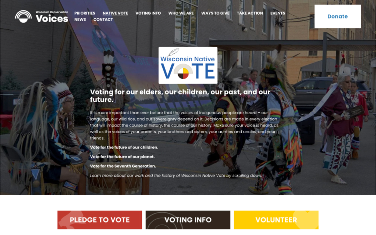
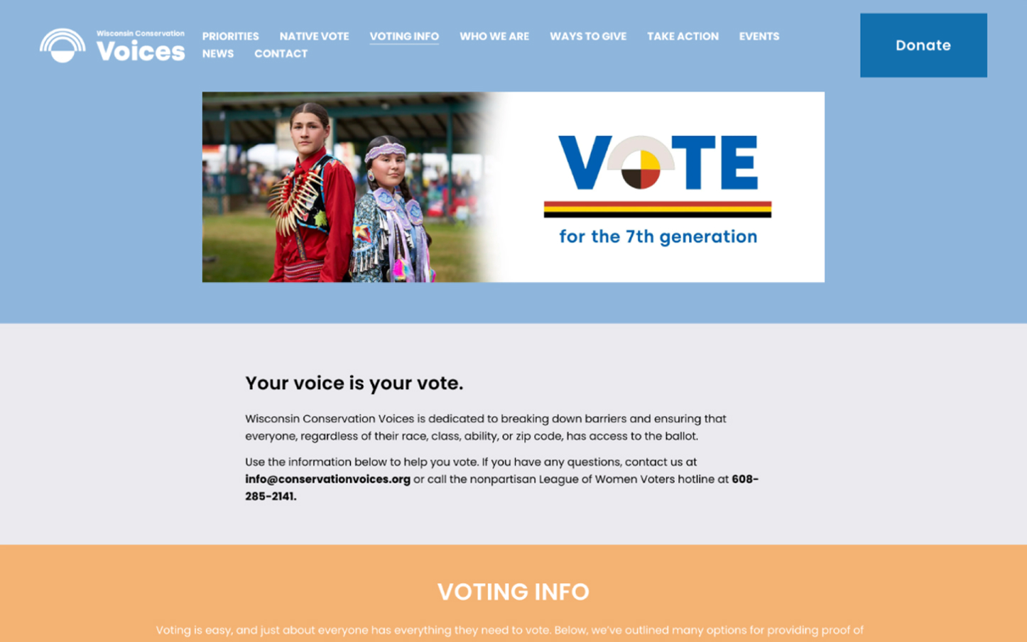
Performing this analysis helped us gain a better understanding of how other organizations in the landscape’s websites capture attention, foster trust, and promote action in comparison to how the existing website does. The following outlines key differences we observed between other organizations’ sites and WNV’s webpages:
After learning more about WNV, the goals for their website, and the areas in need of improvement outlined above, we developed problem statements and solution propositions based on research, best practices, guidelines, and team insights to inform design ideas and changes.
.jpg)

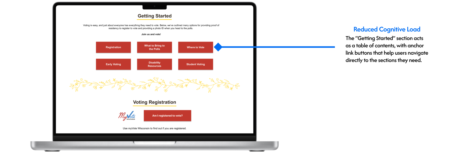
We created wireframes based on our proposed problem-solution statements and provided feedback on the designs before moving on to create higher-fidelity versions for our prototype.
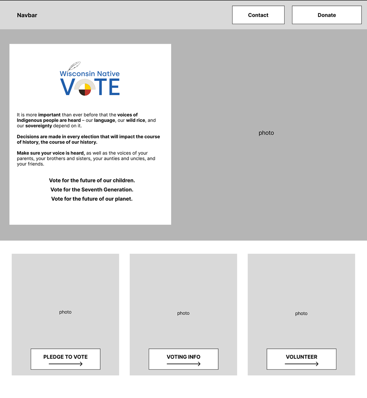
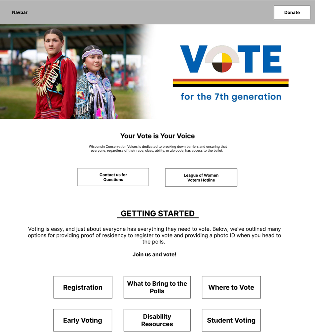
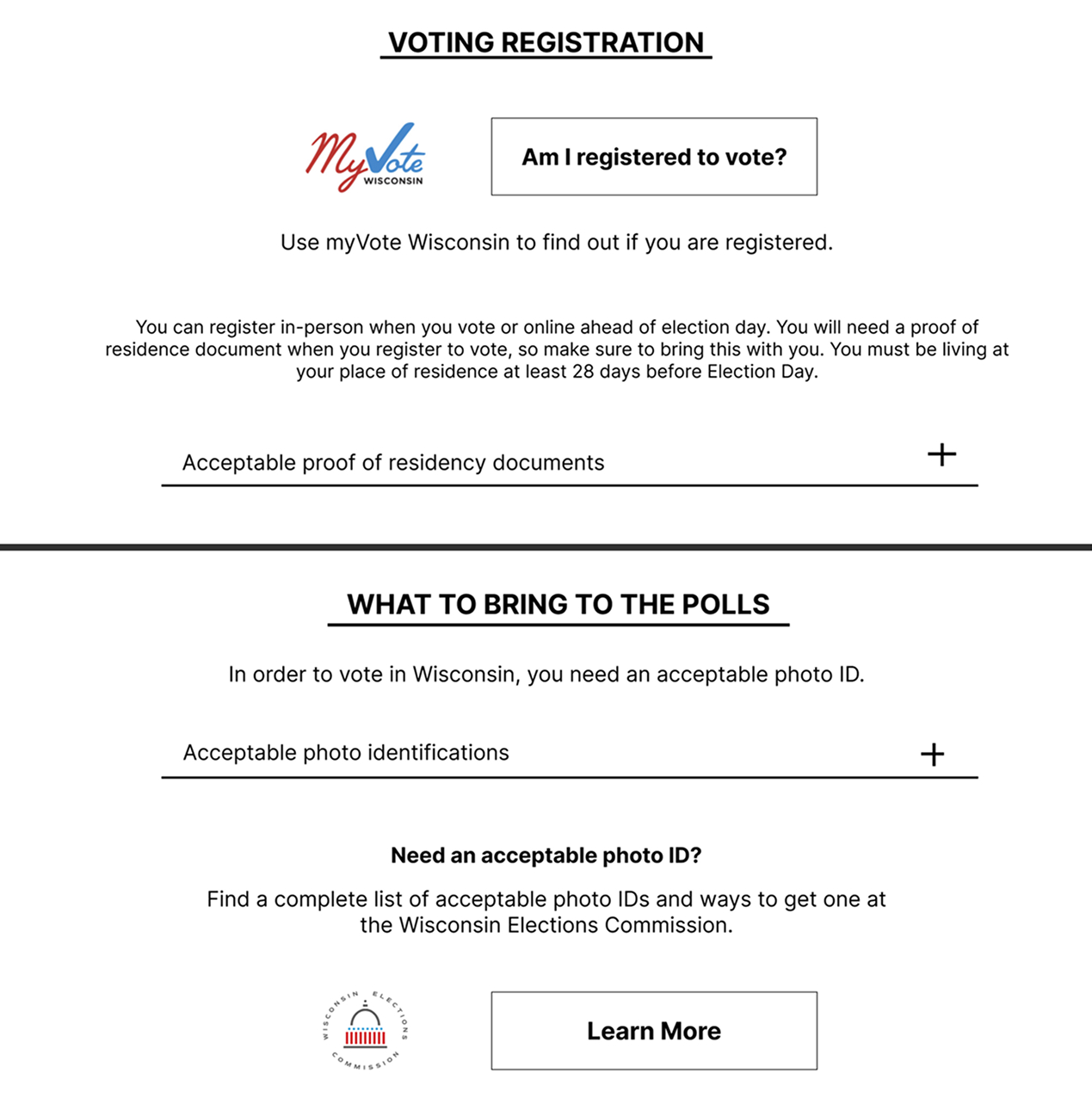
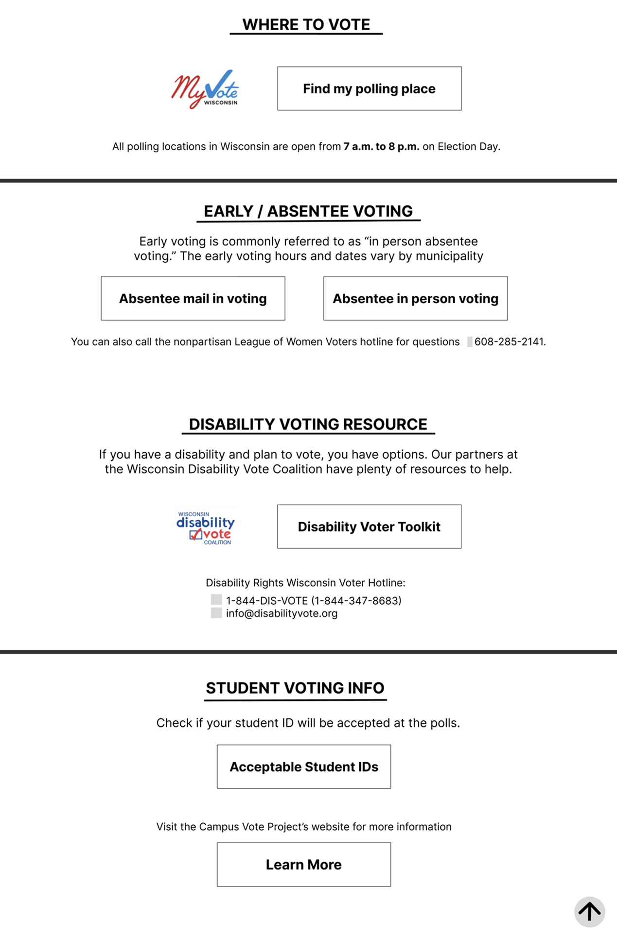
While creating our prototype, we incorporated feedback from our wireframes, adhered to brand guidelines, and considered accessibility requirements.
Feel free to try out the prototype below.


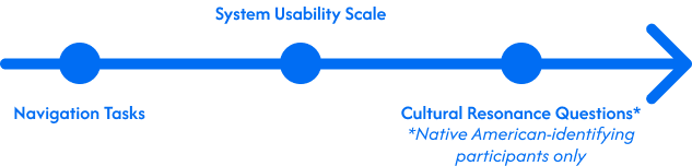
As the usability study lead, I ran a three-part asynchronous usability study to evaluate design decisions in our prototype. I designed the study and recruited participants, then analyzed submitted screen recordings to observe how users interacted with the prototype. The analysis measured task success rates, System Usability Scale scores, qualitative feedback, and perceived cultural resonance between the existing website and the prototype. These insights revealed usability issues and cultural impact, and directly informed design refinement recommendations before implementation.
Based on the usability study findings, we recommended the following next steps before implementation:
This project aimed to improve the accessibility, usability, and credibility of WCV’s Native Vote and Voting Info pages. The redesign improved accessibility through higher contrast and reduced clutter, enhanced usability with clearer hierarchy and prominent CTAs, and strengthened credibility through authentic storytelling imagery, impact statistics, and a cohesive WNV brand color palette. Notably, the redesign meets WCAG AA contrast standards, is easier to navigate, and was perceived as trustworthy by Native American participants. Through the usability study, I realized that some button labels and headings did not align with users’ mental models, making it harder for users to complete tasks like locating voter registration documents. This reinforced the importance of clear, scannable language and supportive iconography to help guide users. From a process standpoint, I learned that testing early with low-fidelity prototypes rather than only the high-fidelity prototype surfaces issues earlier and makes iteration more efficient, which is a lesson I’ll carry into future projects.